
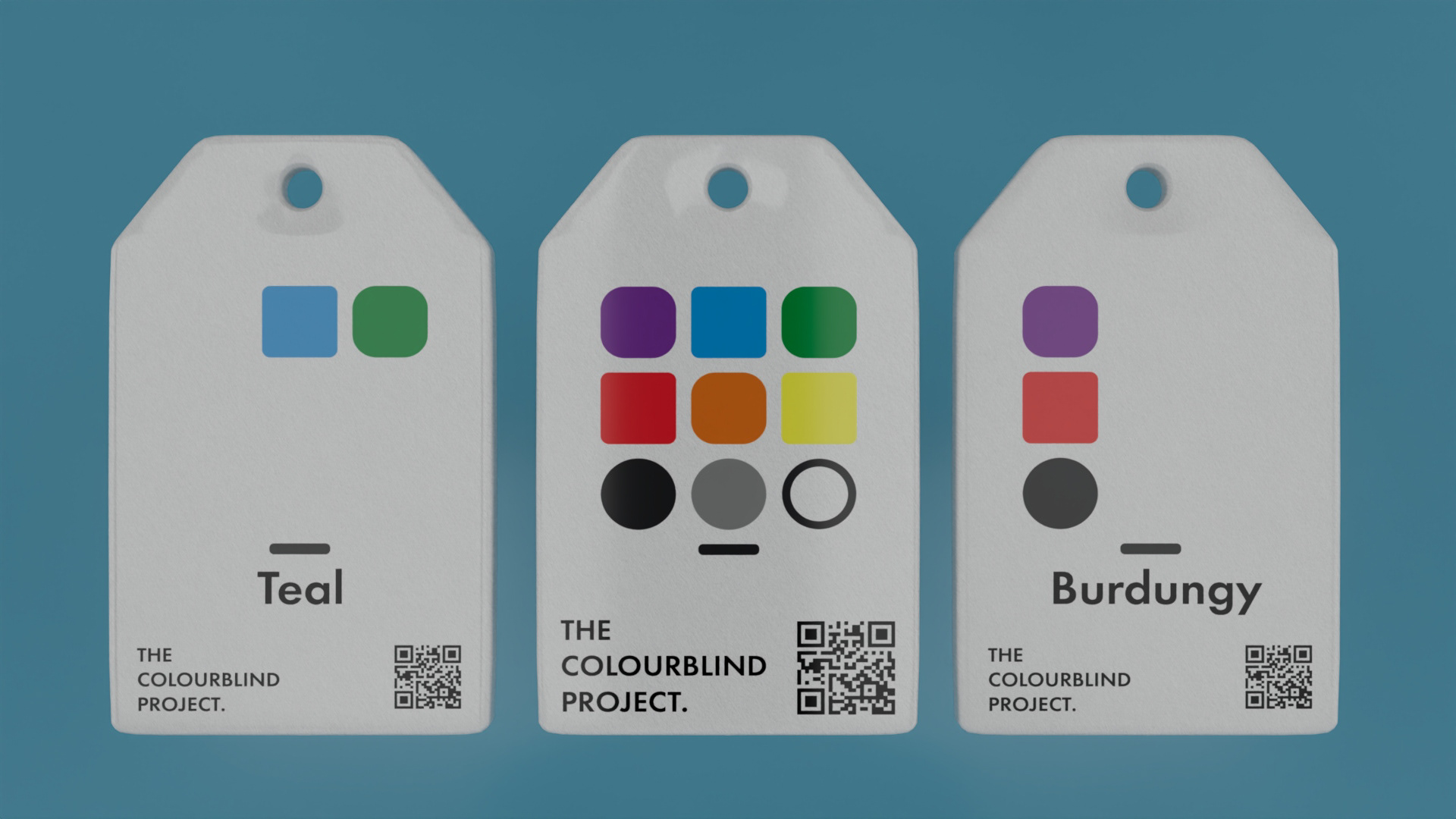
A low-tech, scalable, and unobtrusive language system designed for labelling and packaging. This visual communication system allows colour-blind individuals to quickly identify colours of products, allowing them to shop independently, creating a world where colour belongs to everyone.
BACKGROUND
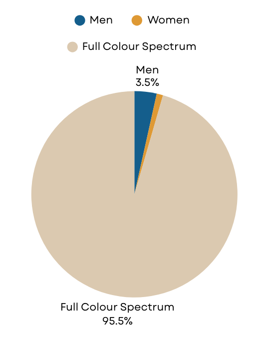
Approximately 8% of men and 0.5% of women in the world have colour blindness, who face challenges daily due to colour dependent design. Purchasing coloured clothing, differentiating fresh produce and distinguishing traffic lights/emergency signals are all key issues that colour blind people face. Colour Vision Deficiency (CVD) is recognised as a disability in Australia under the Disability Discrimination Act 1992, protecting people with colour blindness from discrimination.
Despite this, there are few brands that focus on accessibility for colour blindness. This may be due to a lack of awareness, or the fact that many individuals go through life without realising they are colour blind. Being a primarily genetic condition, the average age for detecting colour blindness is around four years old. However, there are instances where individuals develop it later in life due to other conditions such as macular degeneration or diabetes.
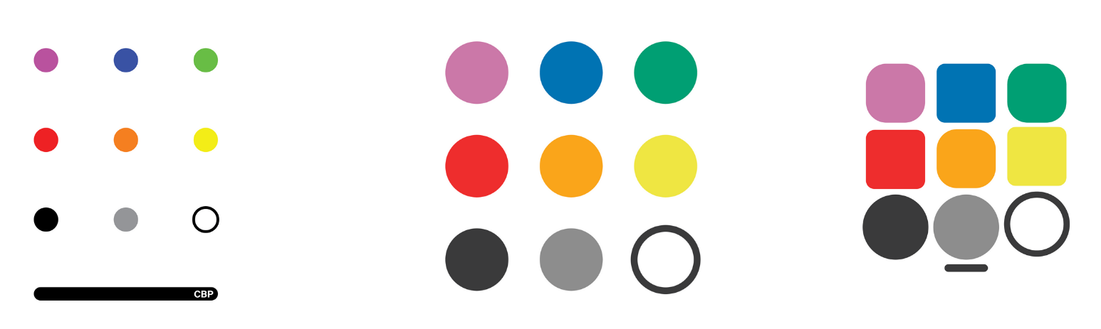
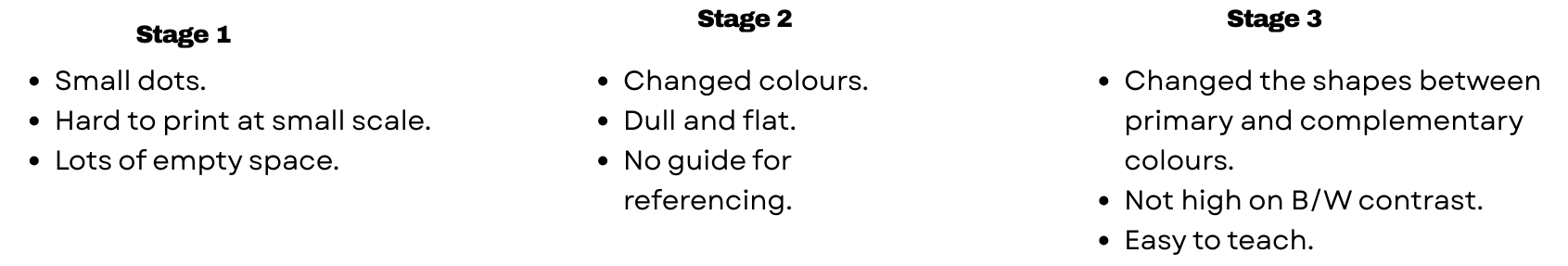
CBL Design Iterations
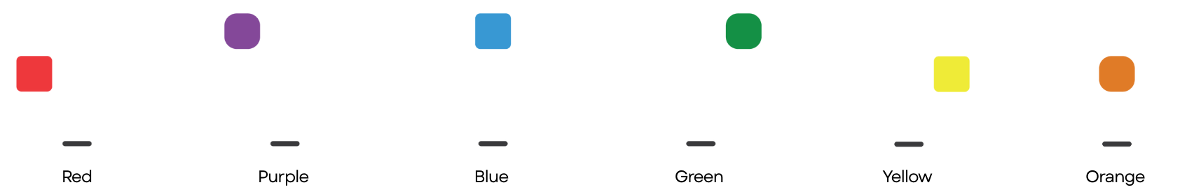
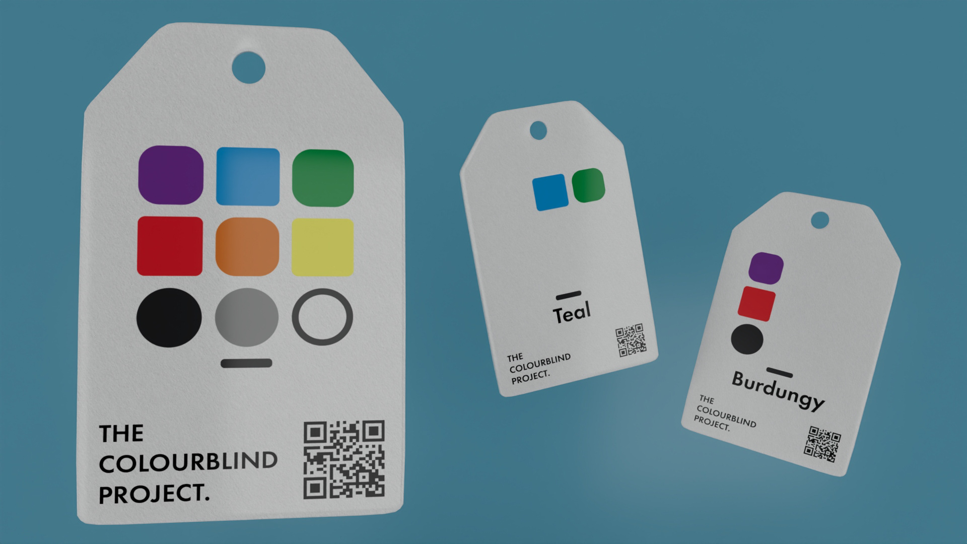
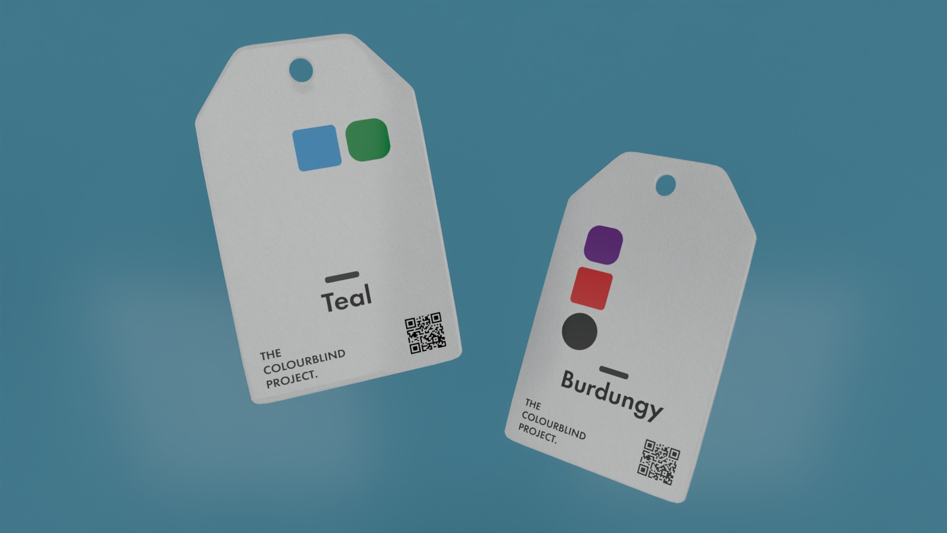
Shape Geometry for Colour Identification
Each colour is represented by a distinct shape corresponding to its position on the colour wheel. More angular shapes signify primary and secondary colours, such as red, blue, and yellow, while more rounded shapes represent transitional hues between primary colours, like purple, green, and orange. This allows users to quickly identify a colour's family or spectrum range, even without seeing its actual hue.
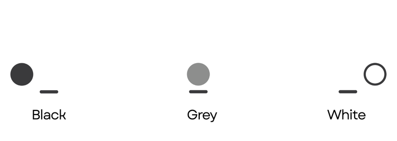
Shade Indicators
A bottom row of three circular icons communicates the relative brightness of a colour: A black circle denotes a dark shade, a grey circle indicates a medium tone or sheen, and a white ring represents a light or bright tone. This system enables users to distinguish between shades, such as navy blue and sky blue, providing critical nuance for real-world decisions in areas like fashion, art, and shopping.
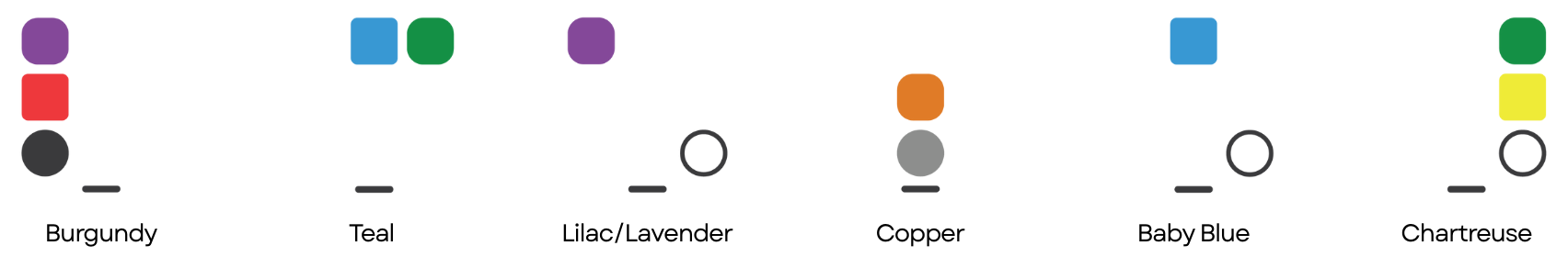
Directional Consistency
A horizontal line at the bottom of the icon set serves as an anchor, guiding users on how to correctly interpret the symbols. This ensures the system remains reliable, regardless of orientation or application, whether printed on tags, labels, signage, or digital interfaces.
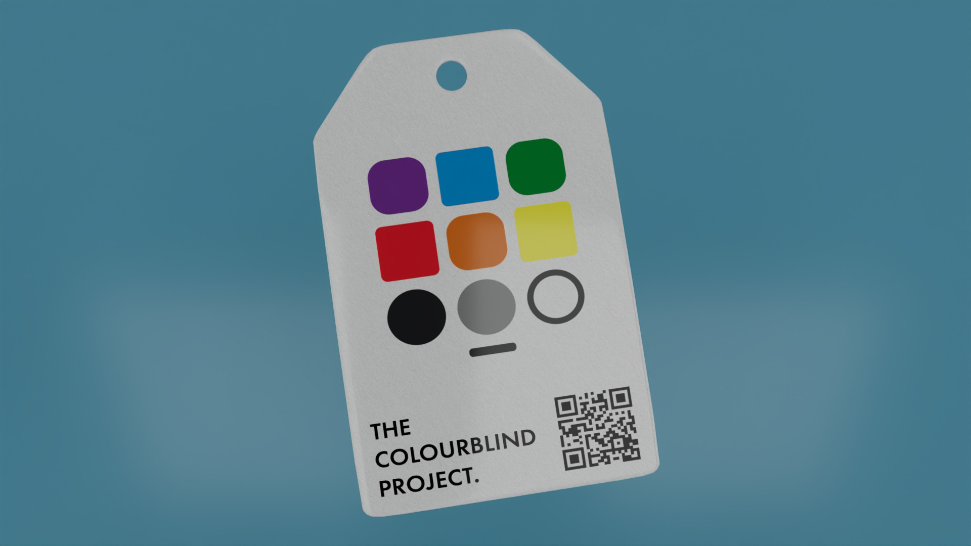
Mock-ups created in Autodesk Maya, Adobe Photoshop and Illustrator